Brand Overview
한국과 중국의 사랑을 받고 있는 3CE의 새로운 시장 확장을 위해 제작한 프로젝트입니다.
브랜드 아이덴티티를 재정립하고 3CE만의 새로운 아름다움을 개척해나갑니다.
It is a project made to expand the new market of 3CE, which is loved by Korea and China.
Reestablish brand identity and explore new beauty unique to 3CE.
Brand concept
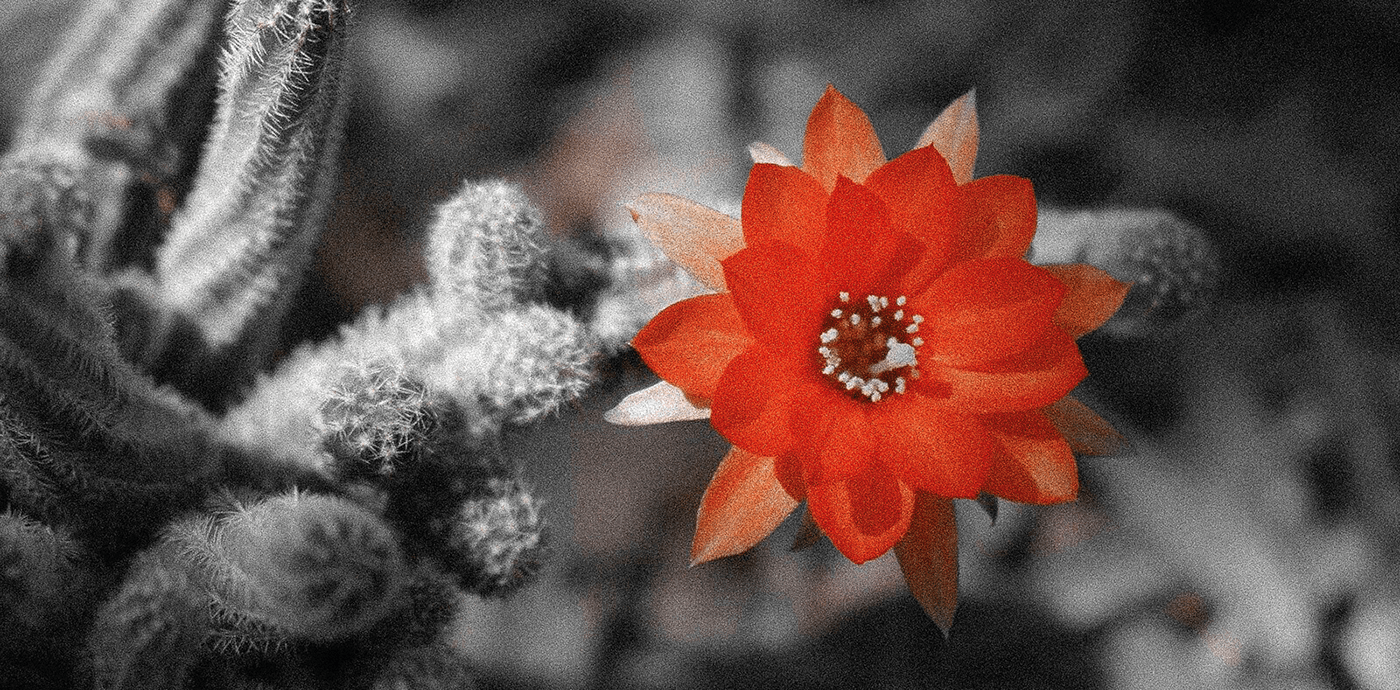
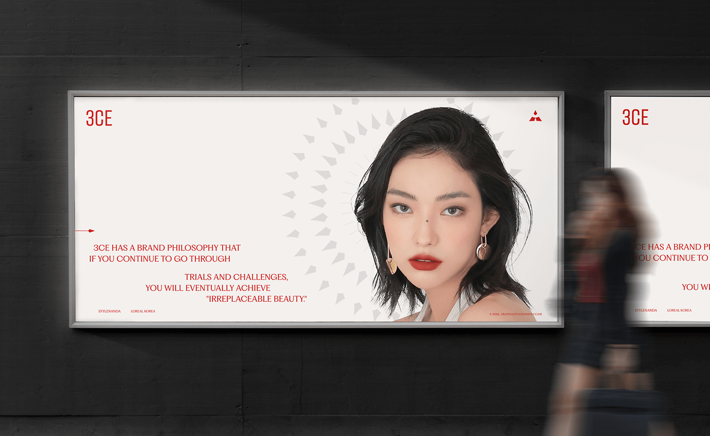
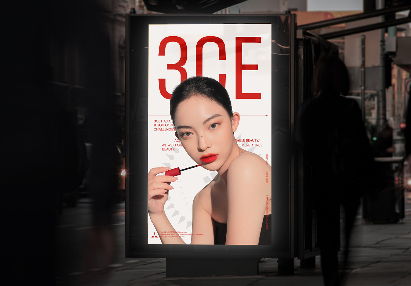
3CE의 새로운 '미'의 정의는 진취적인 도전과 인내의 아름다움입니다. 진취적인 도전과 인내로 결국 원하는것을 쟁취 해나가는 과정의 아름다움을
브랜드 아이덴티티로 담았습니다. 선인장 꽃 '백단'은 꽃을 피우는 한순간을 위해 혹독한 환경에서 모래먼지를 맞고 견디다 결국 독보적으로 아름다운 꽃을 피워냅니다. 선인장이 꽃을 피워내기 위한 과정과 결과가 3CE의 정체성을 상징합니다.
3CE's new definition of 'beauty' is the beauty of enterprising challenge and patience. The brand identity captures the beauty of the process of eventually achieving what you want with enterprising challenges and patience. The cactus flower "Baekdan" endured sand dust in a harsh environment for the moment of blooming and eventually produces an unrivaled beautiful flower. The process and results of the cactus' flowering represent the identity of 3CE.
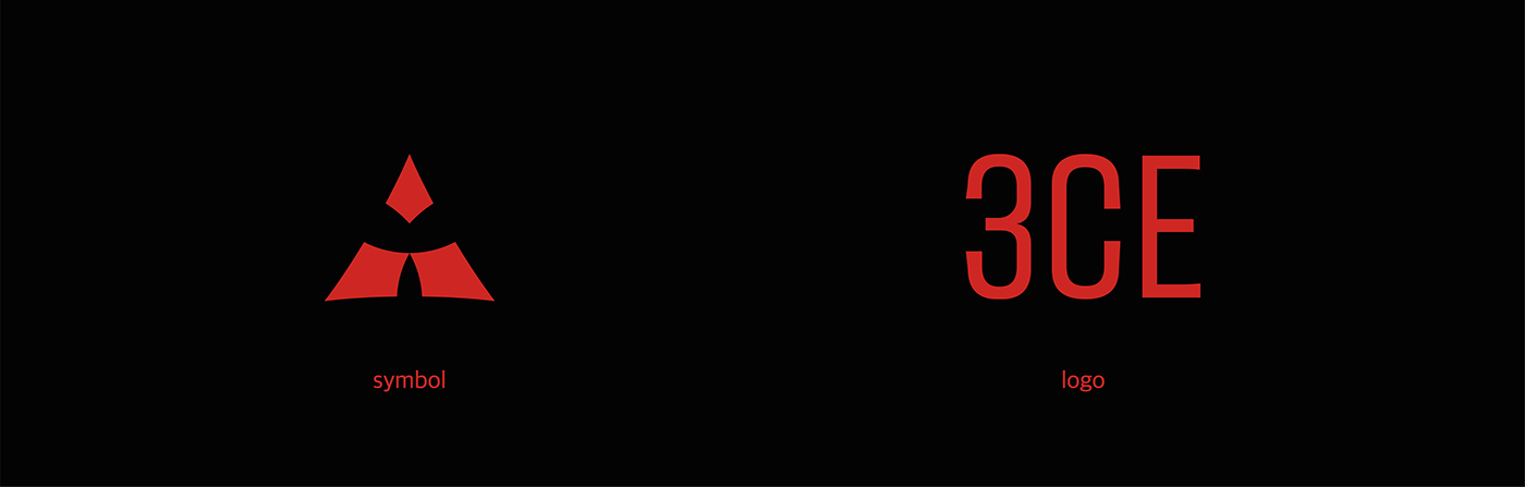
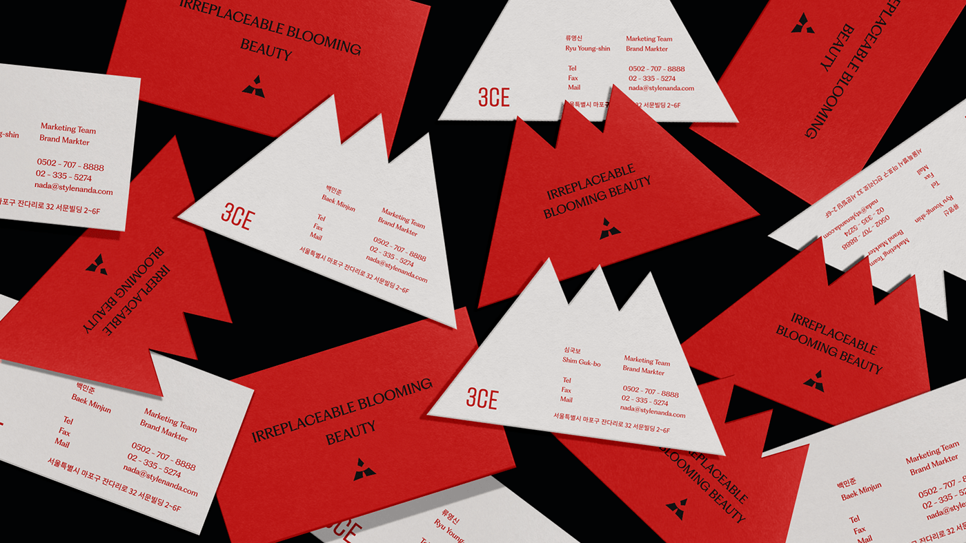
Brand logo & symbol
브랜드 정체성에 맞는 로고와 심볼을 제작하여 진취적인 이미지를 전달합니다.
Create logos and symbols that fit the brand's identity and provide an enterprising image.
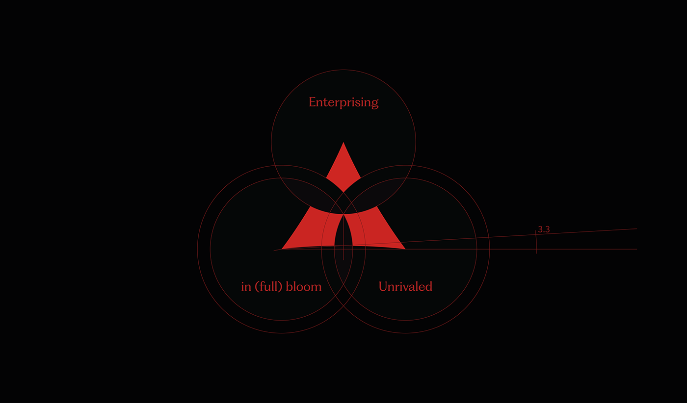
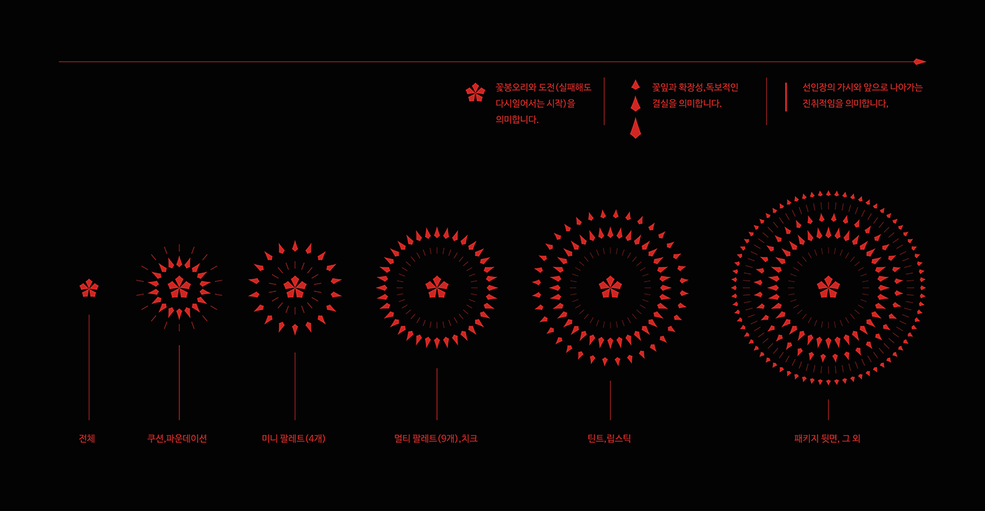
Brand motif
브랜드 정체성에 맞는 로고와 심볼을 제작하여 진취적인 이미지를 전달합니다. 고객의 화장 단계에 따라 점차 꽃이 펴지며 진취적 도전과 확장
그리고 마침내 독보적인 아름다운 결실을 얻는다는 것을 모티프로 표현했습니다.
Produce logos and symbols that fit the brand's identity and deliver an enterprising image. Flowers bloom according to the customer's makeup stage, and enterprising challenges and expansion. Finally, I expressed it with motifs that I get unrivaled beauty.
Brand slogan

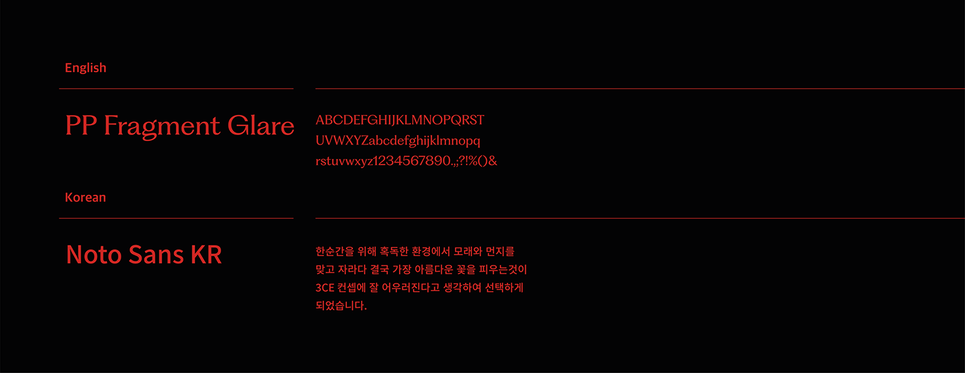
Brand typography
브랜드의 무드와 맞는 전용서체와 폰트를 사용합니다.
Use a dedicated font and font that matches the mood of the brand.
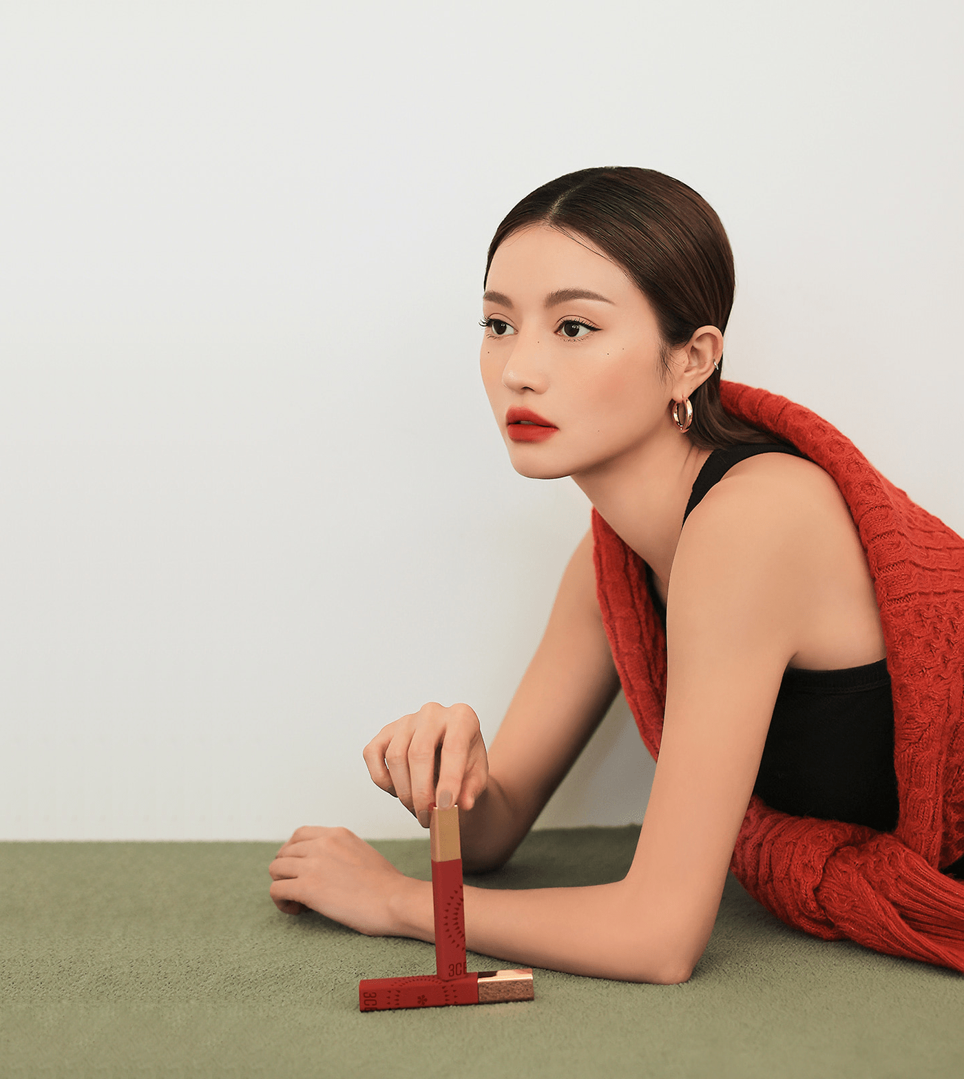
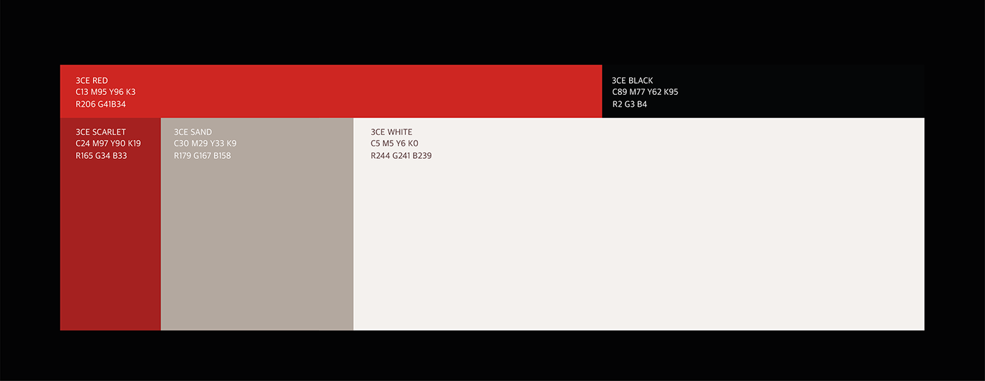
Brand color
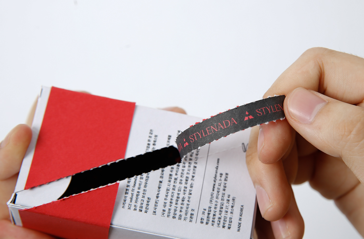
진취적이고 독보적인 아름다움을 상징하는 레드 컬러와 시련을 상징하는 블랙, 브라운계열의 웜톤으로 컬러 선정했습니다.
The brand color was selected as a red color that symbolizes enterprise and unrivaled, and a warm tone of black and brown that symbolizes trials.
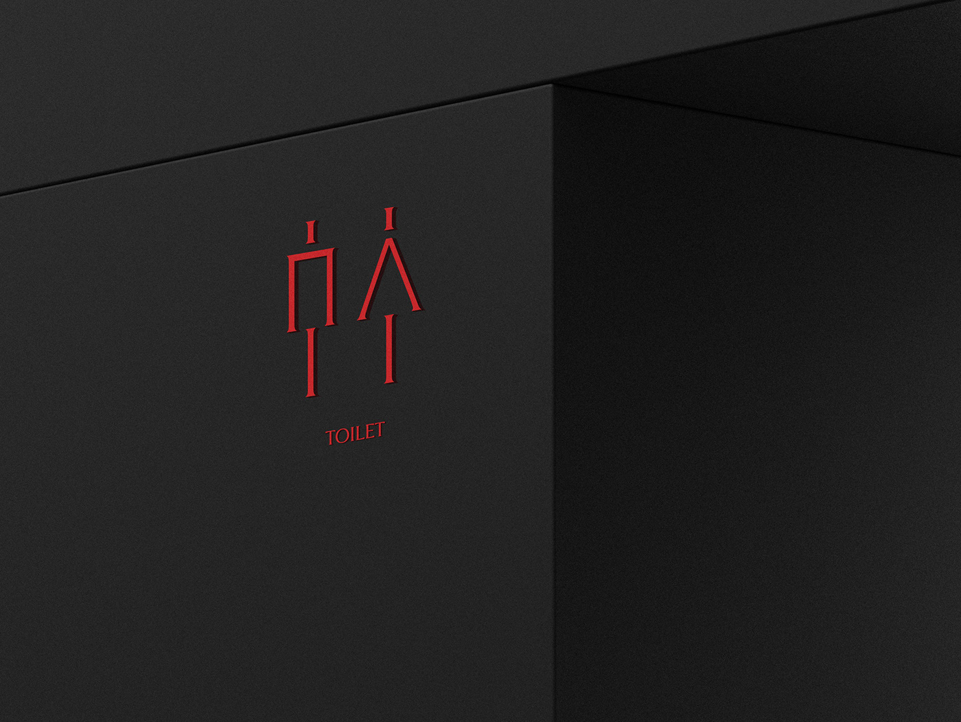
Brand pictogram
브랜드만의 전용 서체와 로고의 진취적인 선을 픽토그램에 활용하여 브랜드 정체성에 맞는 이미지를 제공합니다.
It uses the brand's unique font and enterprising line of logo as pictograms to provide an image that fits the brand's identity.

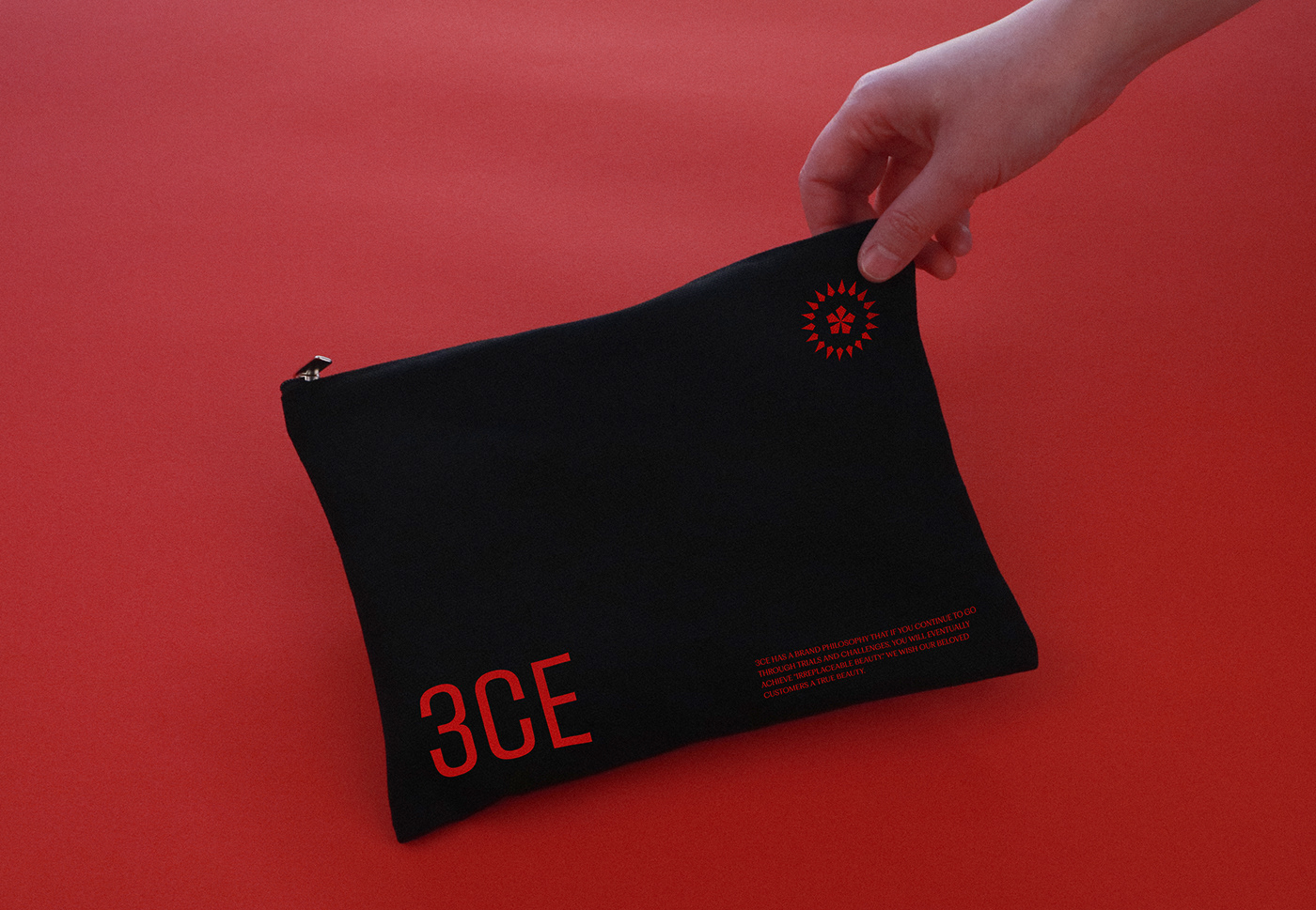
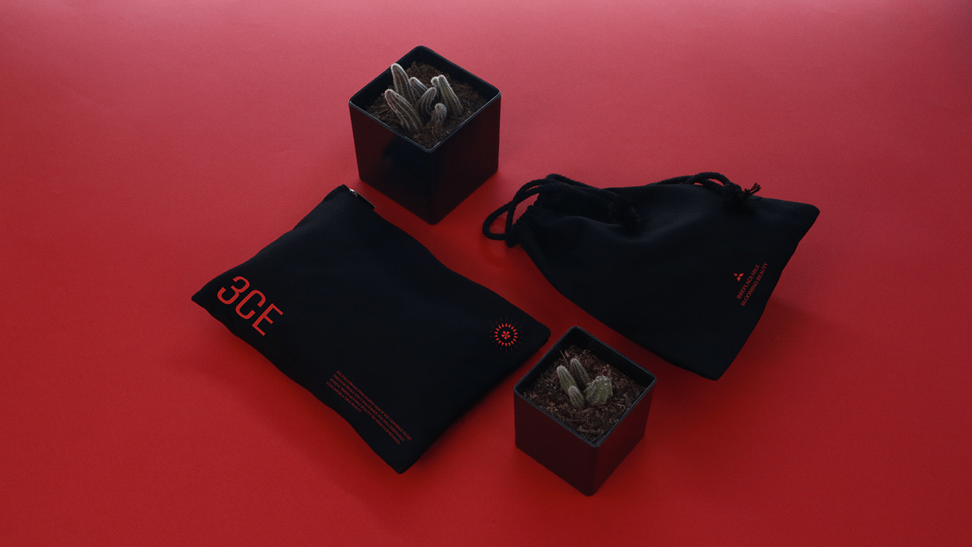
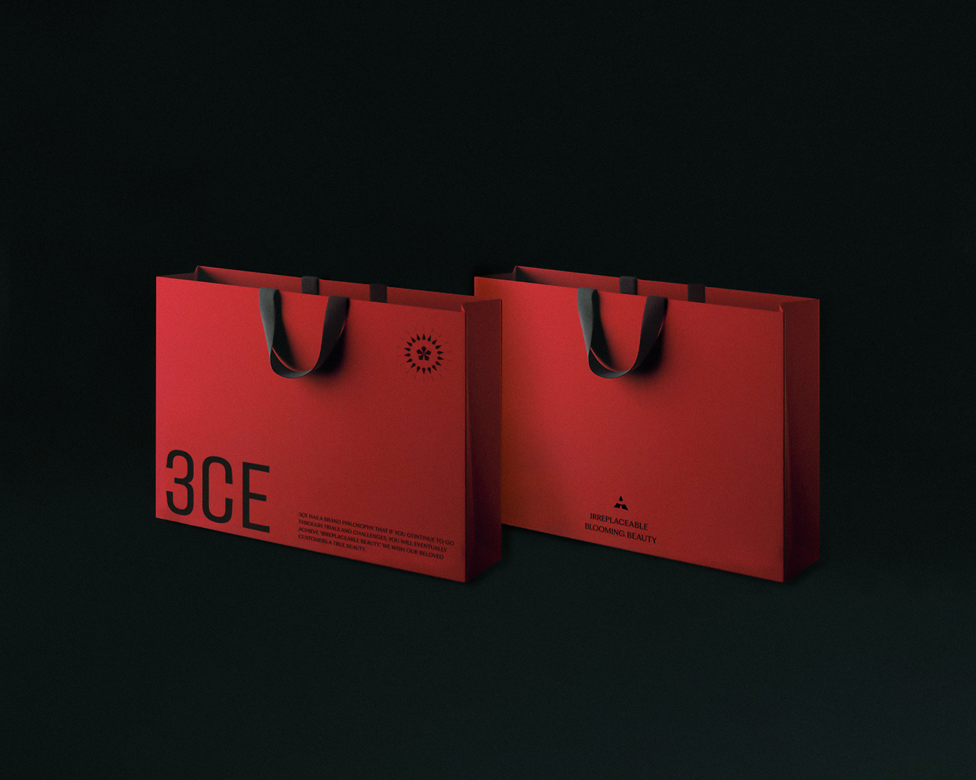

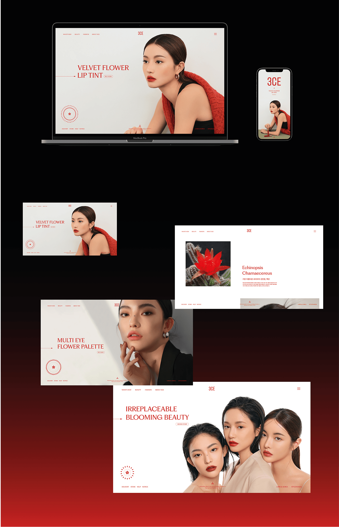
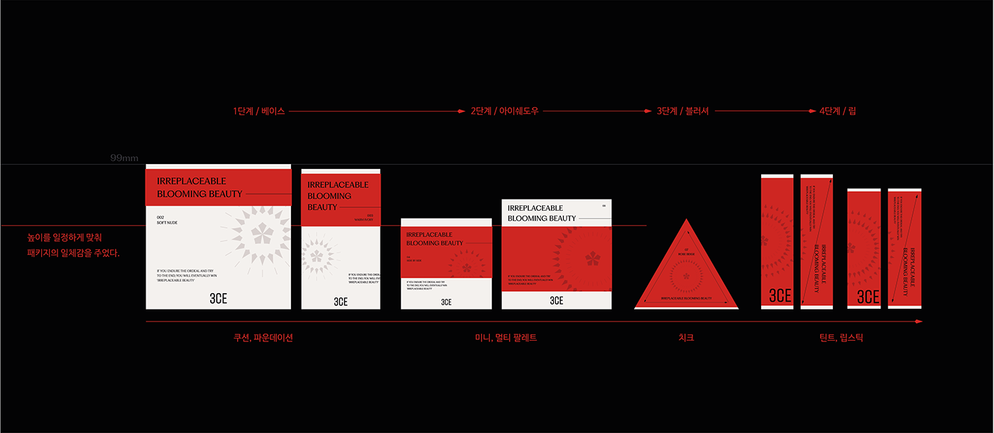
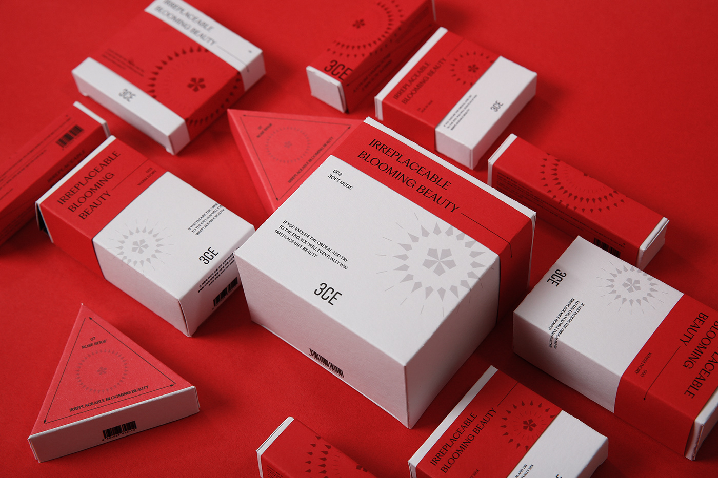
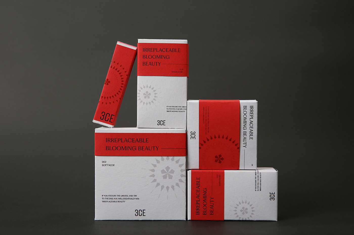
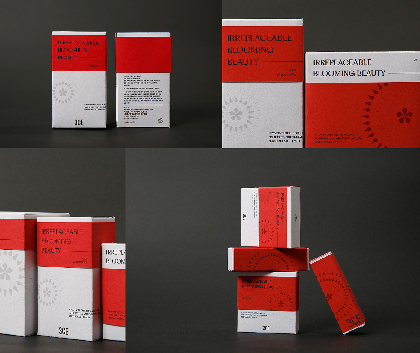
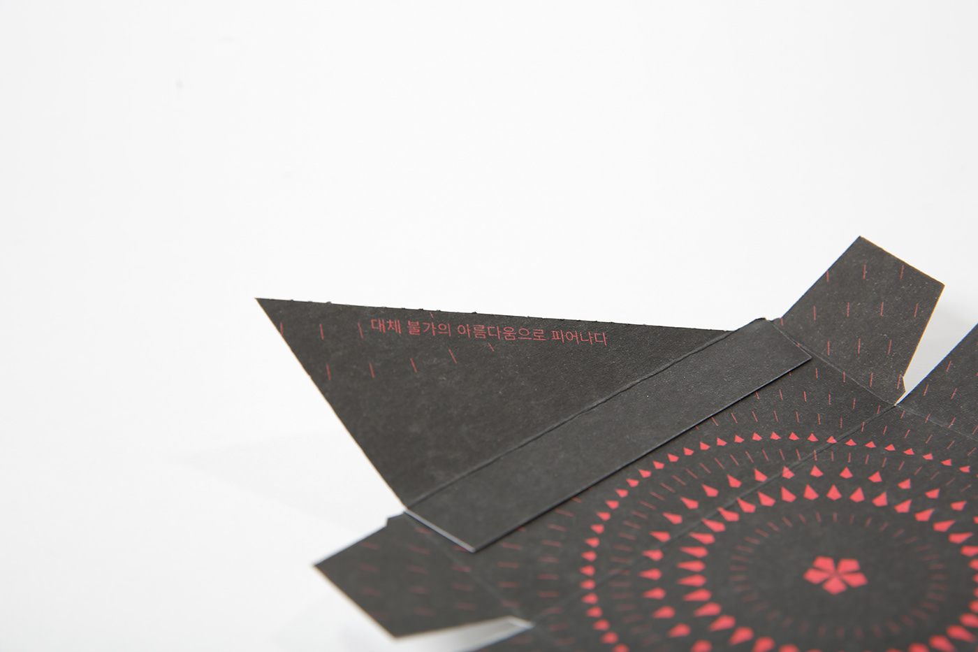
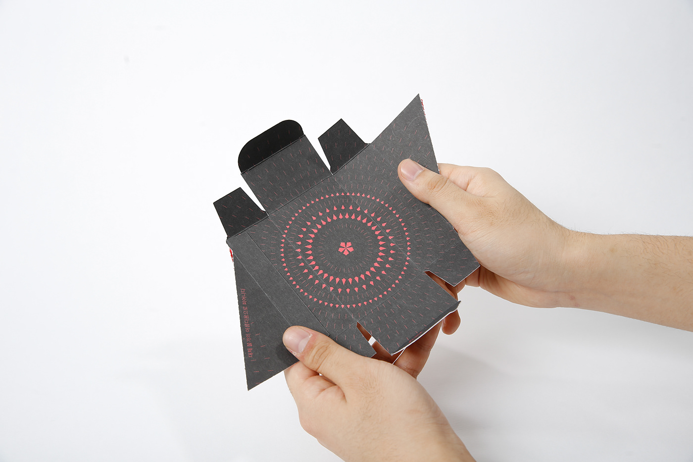
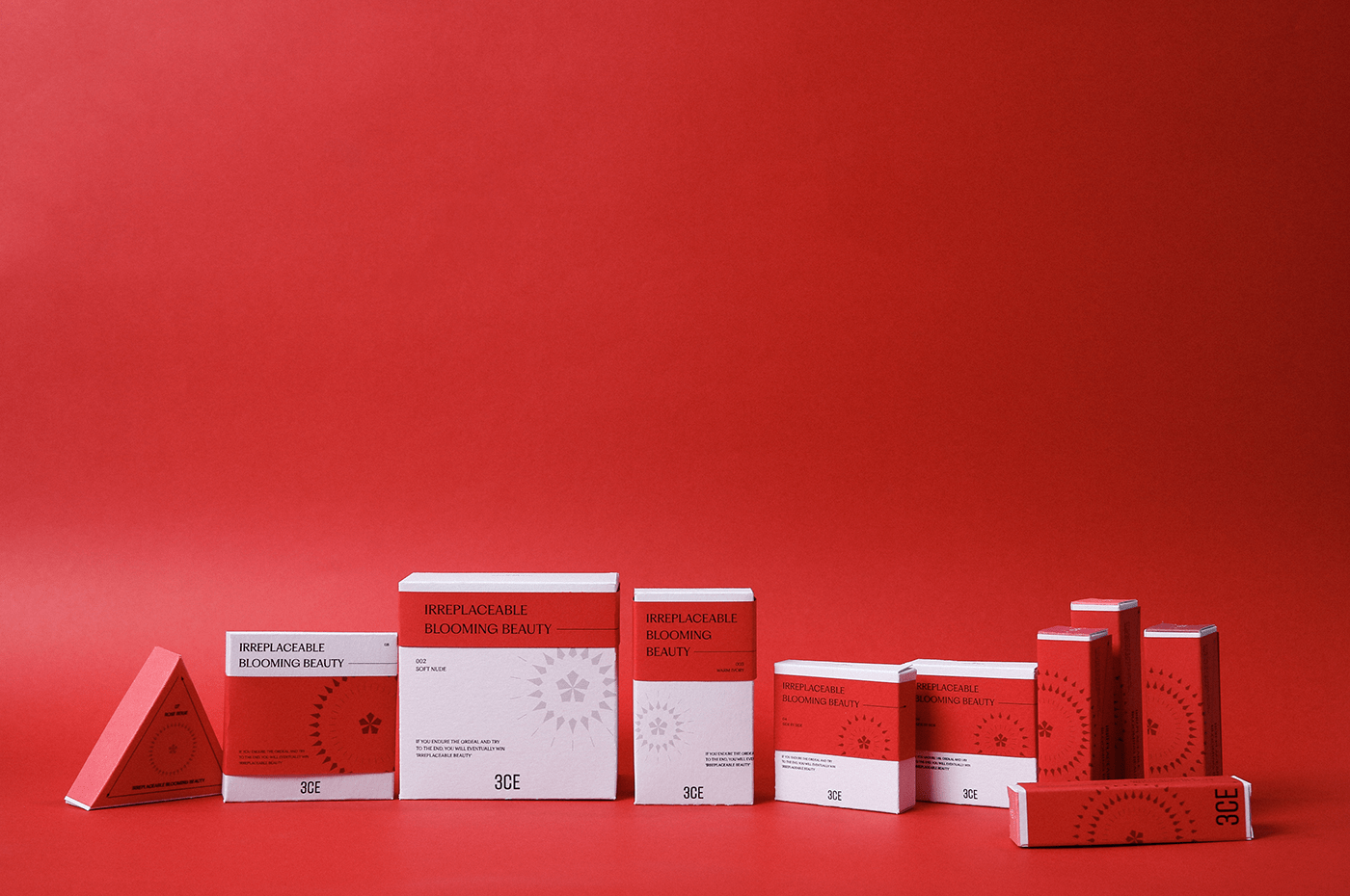
Brand package
화장을 하는 순서마다 붉은 부분의 비중이 높아지면서 대체 불가 아름다움이 완성된다는 것을 표현했습니다.
It expressed that the proportion of the red part increases in the order of putting on makeup, completing irreplaceable beauty.